The Visual Identity of Two Queens
Showcasing our design for two queens in the new book Visuel Identitet – Design Processen.
Accompanied by some of Denmark’s most prominent and inspiring design studios, two of our projects are featured in a newly published book on visual identities. One is the logo and font for her majesty Queen Margrethe II’s jubilee. The other is a grand tour of the universe we made for the Chamberlain Coffee rebrand.
The book is written by lector in graphic design Anne Mette Hartelius from The Danish School of Media and Journalism. Here she has given us, alongside 11 other studios, a platform that invites people into the meticulous process of crafting a visual identity.
A coffee queen and an actual queen
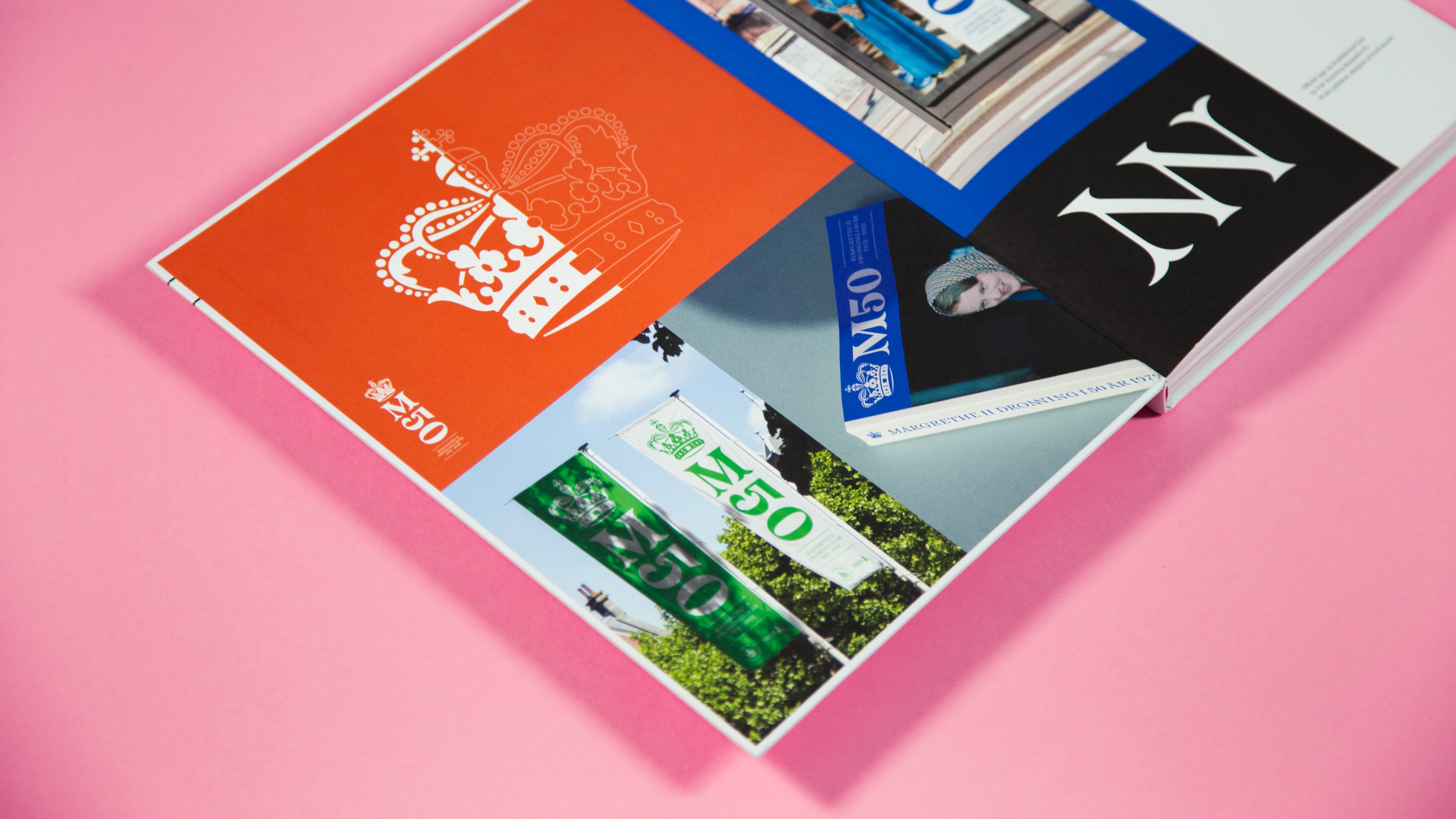
Our royal design for the 50th jubilee of queen Margrethe II welcomes you as you open the book. At the beginning of the year, we had the privilege of redesigning our sitting monarch’s official crown alongside a bespoke typeface and colour palette. Today we have the honour of being pictured on the very first book spread along with the words from our Brand Strategist, Christina Juul Bladt:
“
Fra kulturelle og statslige institutioner til store virksomheder og unge startups bestræber vi os altid på at samarbejde med dem, der udfordrer status quo og skaber ægte forandring.
Christina Juul Bladt
It’s needless to say that design firms put a lot of effort and time into designing and validating a specific identity, logo or typeface. What may come as a surprise is that we spend quite a lot of time researching, discussing and challenging our clients. In their storytelling, values and what that might look and sound like. In this state of the work process, our strategy team really gain ground. Questioning, analysing and shaping the thoughts behind a given design. It’s an intense collaboration, but it’s essential to build a solid foundation for the designers to stand upon.
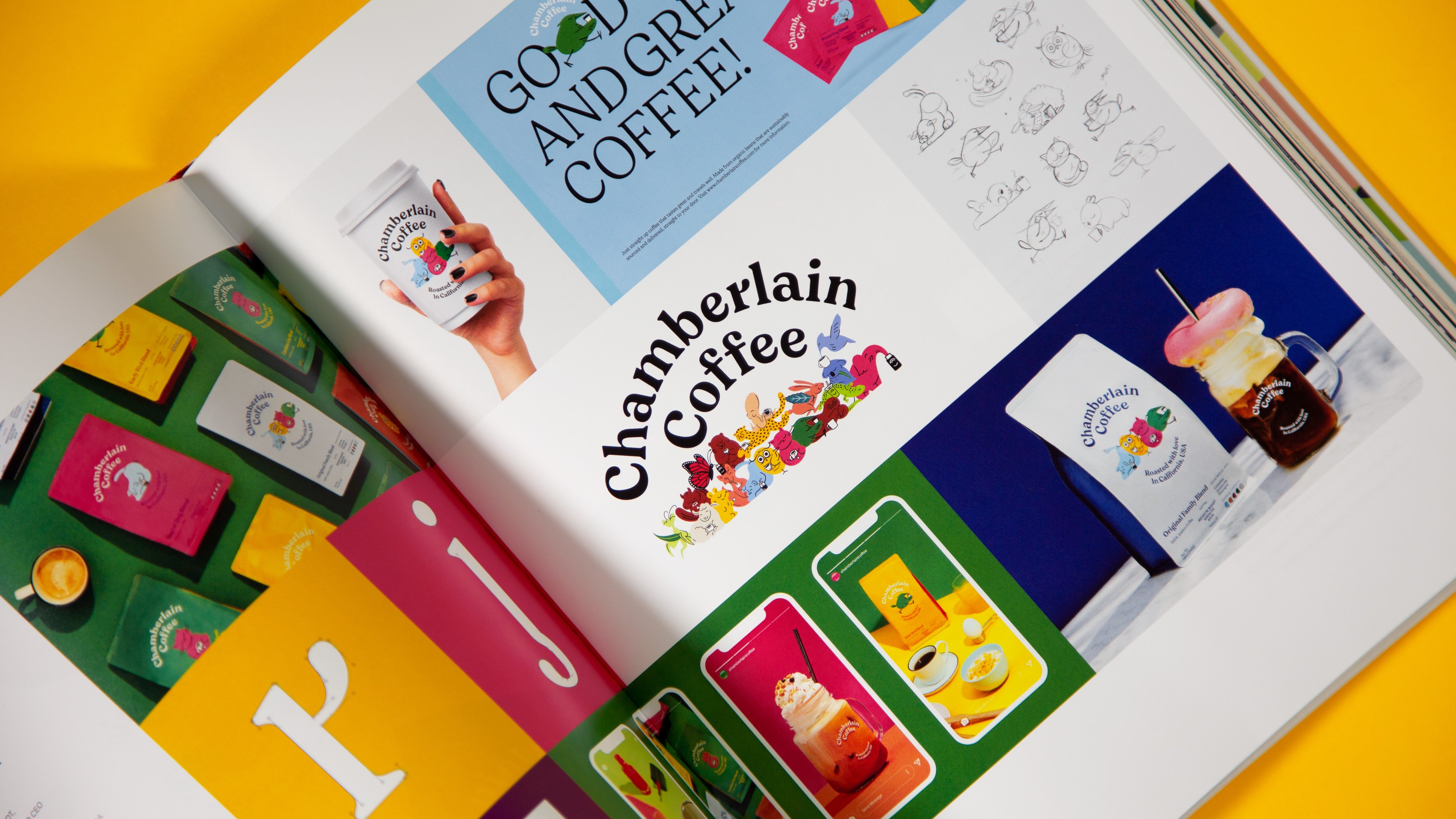
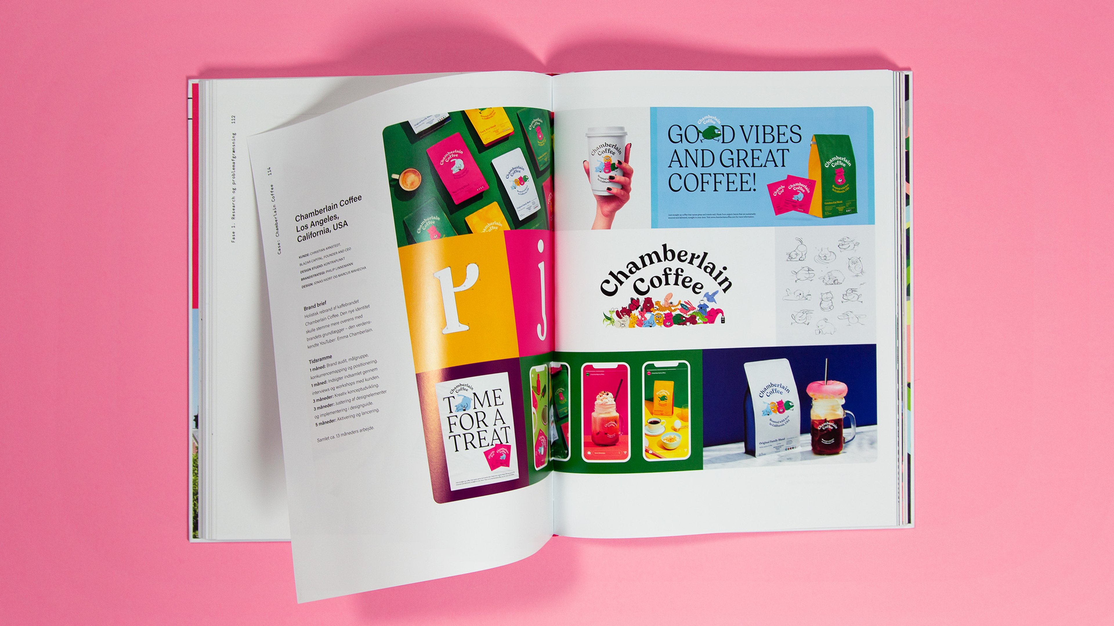
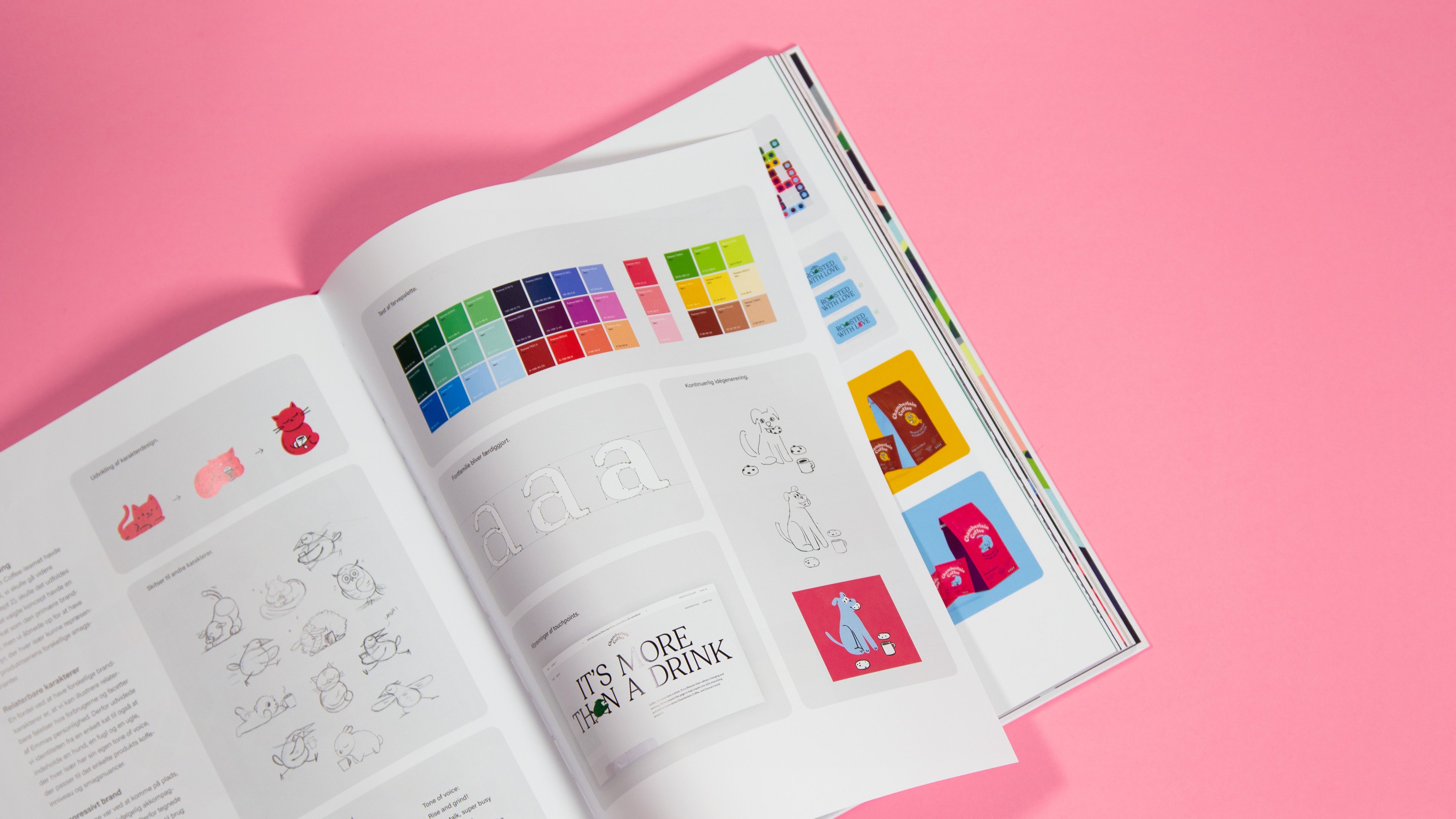
In the case of our other featured Queen, Emma Chamberlain, we spent a total of 13 months crafting the playful and colourful brand of Chamberlain Coffee.
Time-consuming Quality
Right in the middle of the book, an entire chapter is dedicated to our coffee Queen, the youtube-sensation Emma Chamberlain and her coffee brand. It’s a tour de force of the visual and verbal design process. The ifs and buts, the initial research, sketches and arguments for the choices made in collaboration with our client. Hopefully, it’ll give a broader sense of how much time and effort actually goes into building a brand's identity – and how many directions never see the light of day.
We spent over a year going from initial ideas to the final launch for this coffee case. As shown in the book, we explored widely in terms of style, speculating on how we would ensure a maximum impact for the brand as a category changemaker. Obviously, the biggest differentiator was having Emma as its founder; her approach and tone should be the compass for us both visually and verbally.
Tag along for the ride on how we revamped the newly started Chamberlain Coffee brand, intricate research and practical processes alongside 11 other exceptionally crafted cases by some of our country’s most acclaimed design studios.
Congratulations to Anne Mette Hartelius on the launch. We’re honoured to be showcased along with 1505, AM Copenhagen, Barkas, Bold Scandinavia, Designit, Ehrhorn Hummerston, e-Types, Kontrapunkt, Make@, Studio C, Studio Tobias Røder and Urgent.
Product images
Art direction and styling: Brini Fetz / hej Studio
Photography: Morten Bentzon