Behind the screens

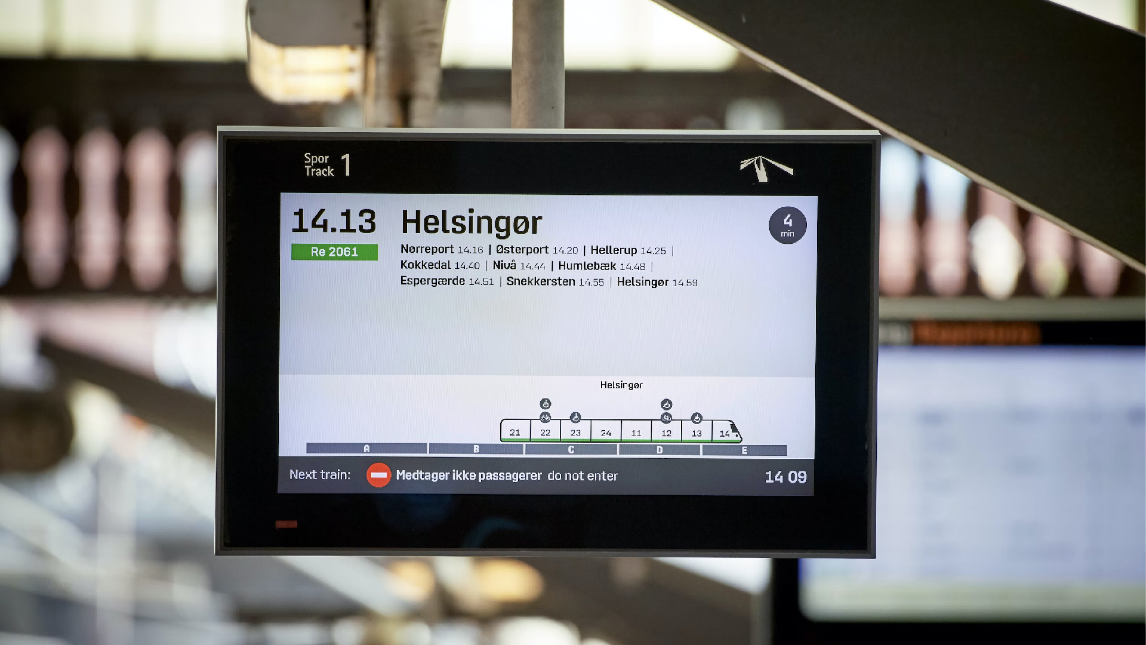
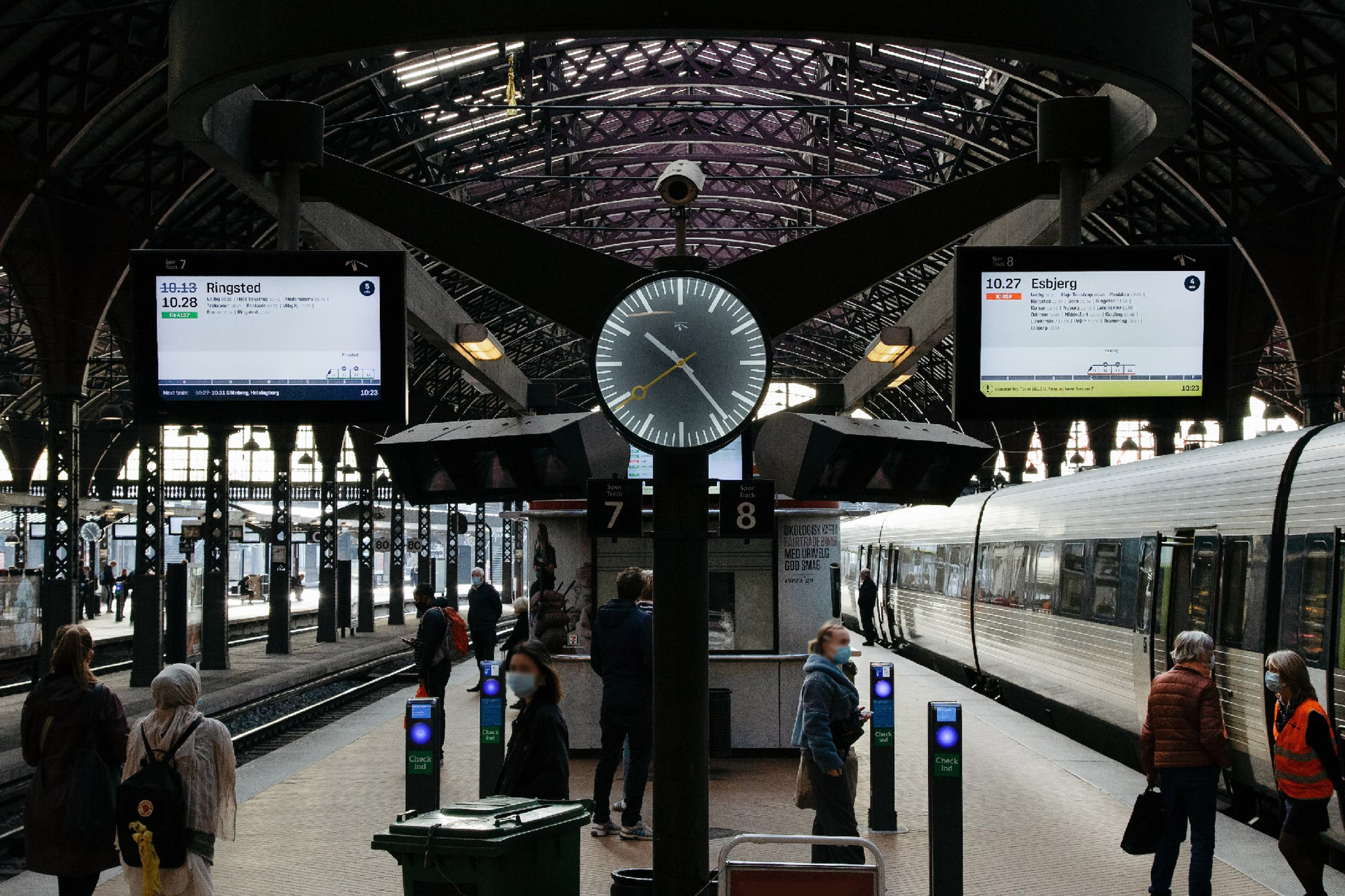
Are you planning on jumping on a train to see friends or family this autumn vacation? Or a day trip into the Danish landscape by your awesome-lonesome? Maybe you already went. Did you notice anything different, when you scouted the station screens for your train? Did it look fresh? Was it more informative? Yes? Okay, enough with the innuendos. We designed a new look for Denmark’s railway station screens, making it easier to understand where to go at the station to get where you want to go in Denmark.
What's new?
Some of the design changes implemented is a bigger and more readable font, more clear icons, new information about the train direction and more helpful information on positioning for the passengers on the platform. In the late months of 2019, Banedanmark tested the new screen design on selected stations across Denmark.

This resulted in great design inputs, and changes were made based on testing and feedback from passengers, and for now, the bugs seem to have been solved, and the design has now been rolled out across all stations in the entire country.
Who is Banedanmark?
Banedanmark, the client behind this project, is a governmental body that’s responsible for keeping Denmark on rails. Literally.
More than 196 million people go from a to b on their network every year. We hope every single person finds our new screen design intuitively informative.
Happy guided travels!

