Royal Copenhagen
A brand as timeless as its porcelain
Client
Royal Copenhagen
Industry
Consumer Products
Deliveries
- Visual Identity
- Campaign Planning & Production
- Messaging Structure & Hierarchy
- Communication Concept
- Storytelling & Tone of Voice
- Video, Motion & Photography
- Campaign Concept
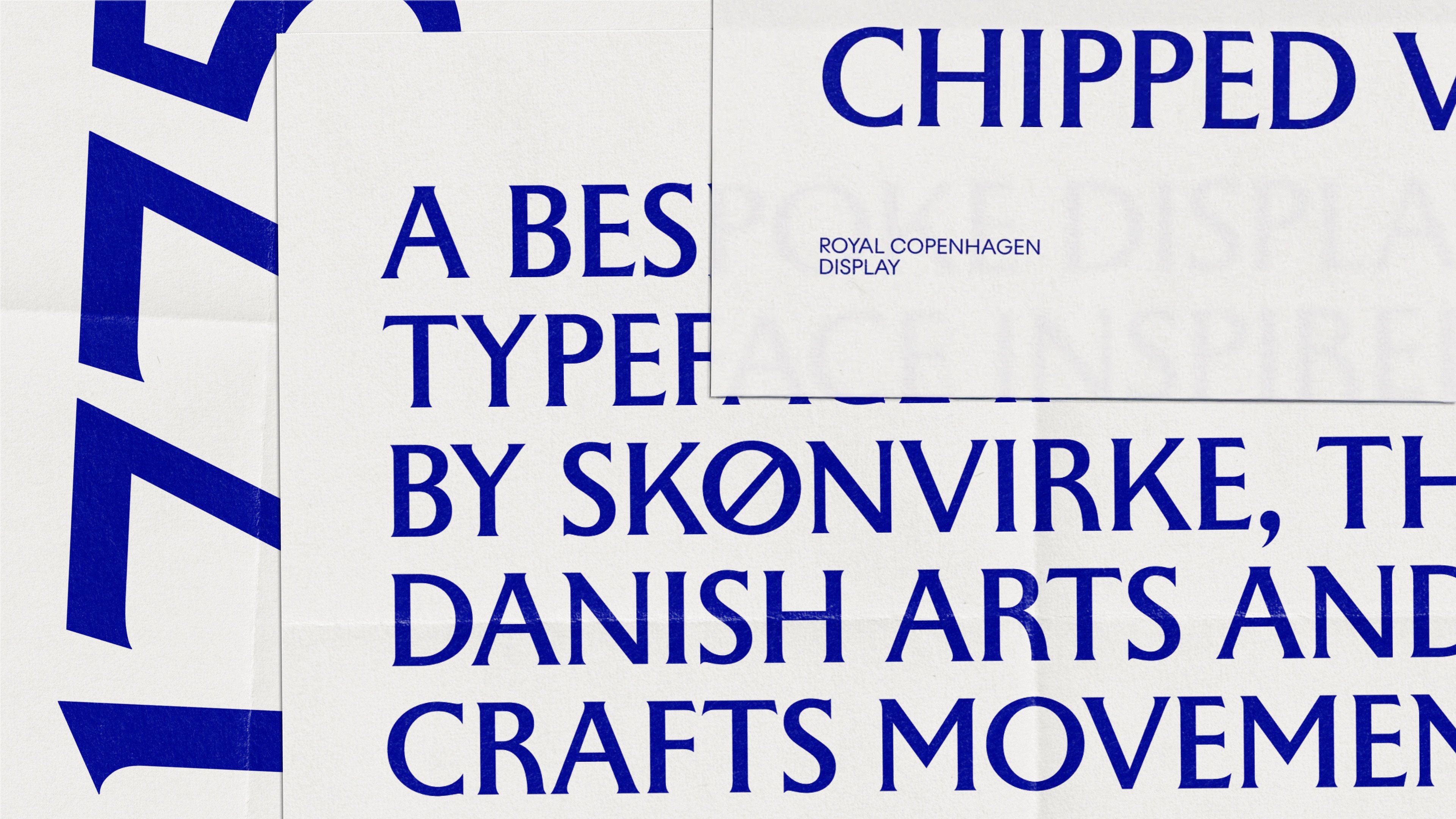
- Bespoke Typeface
- Content Creation
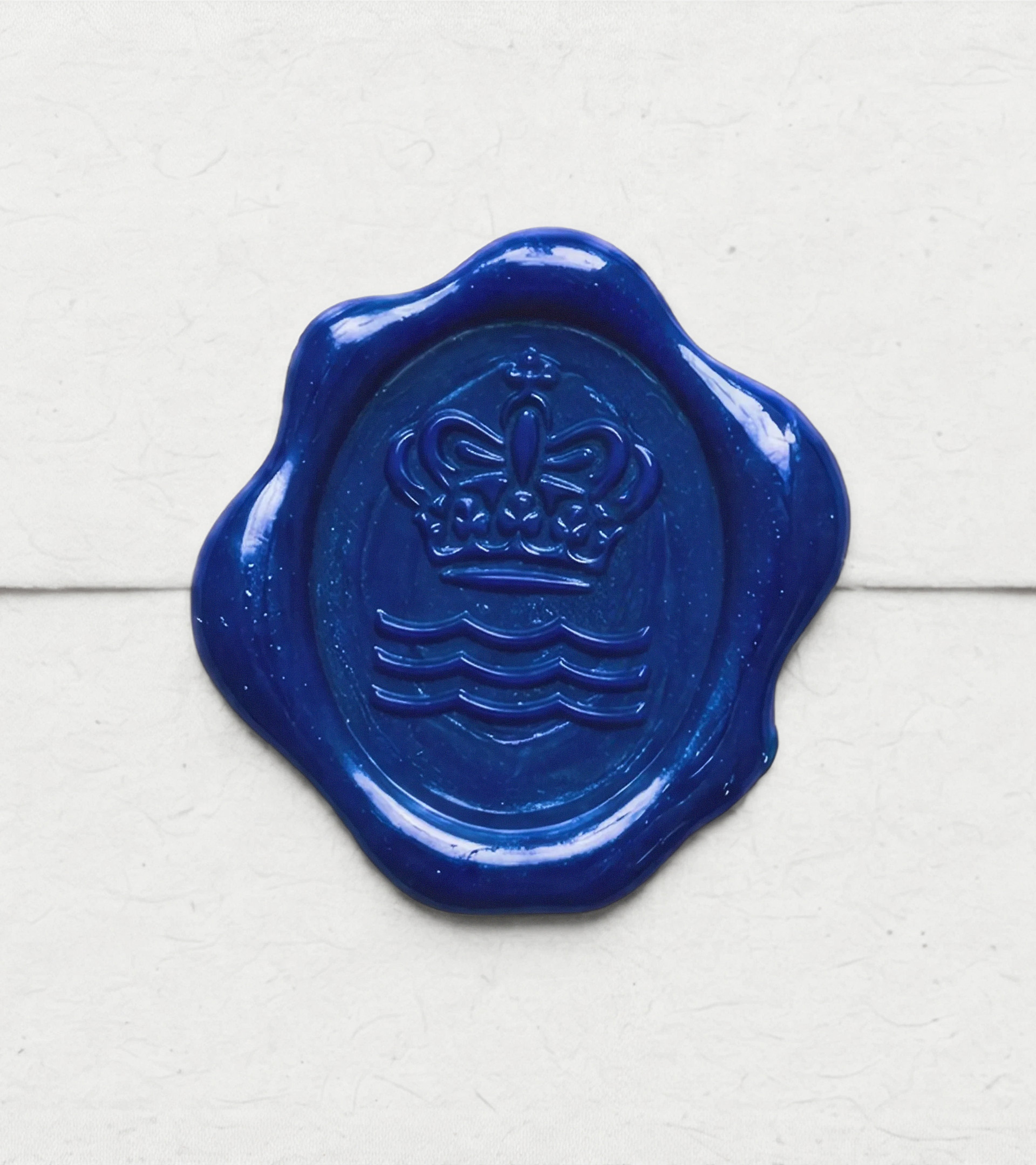
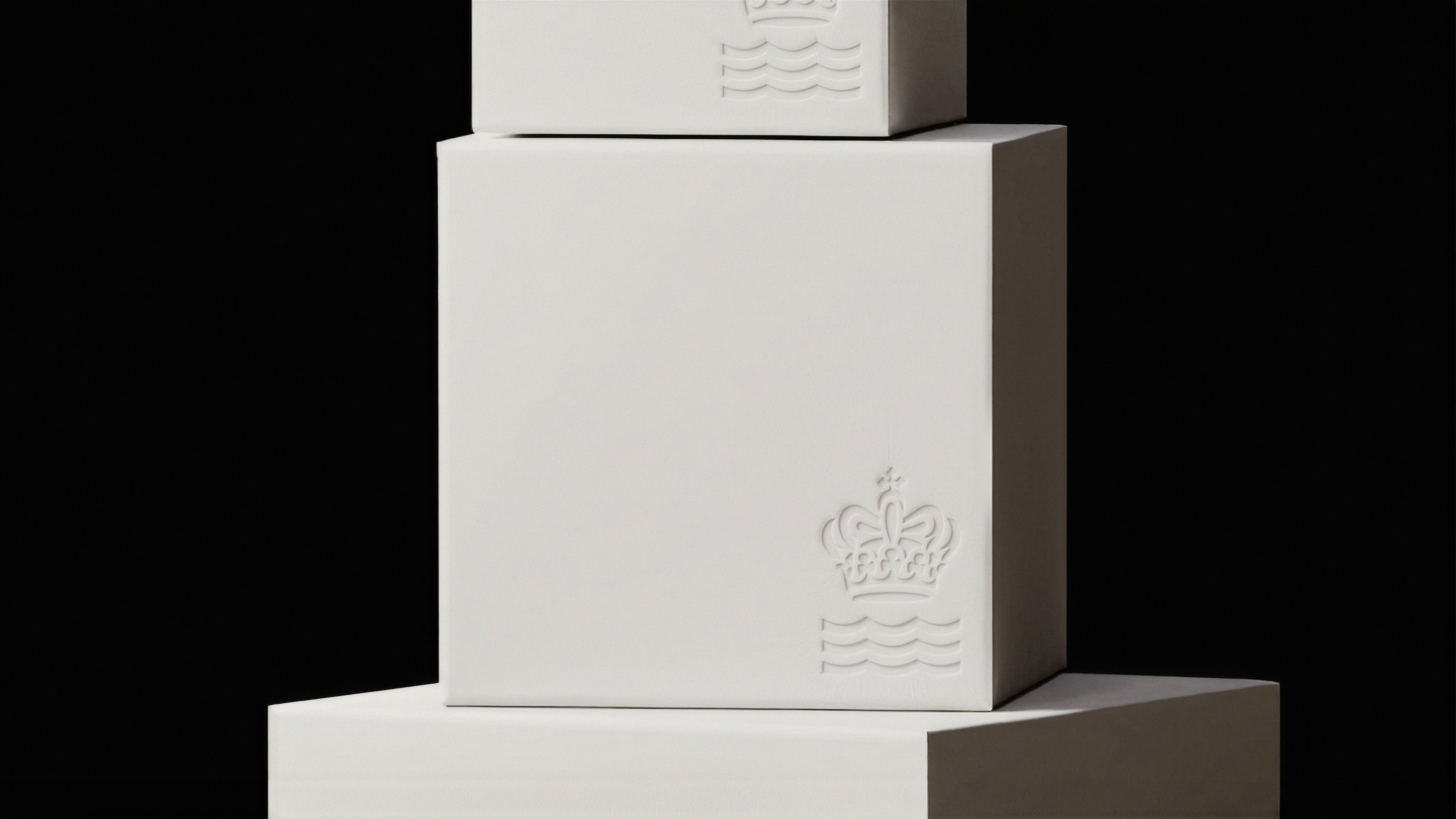
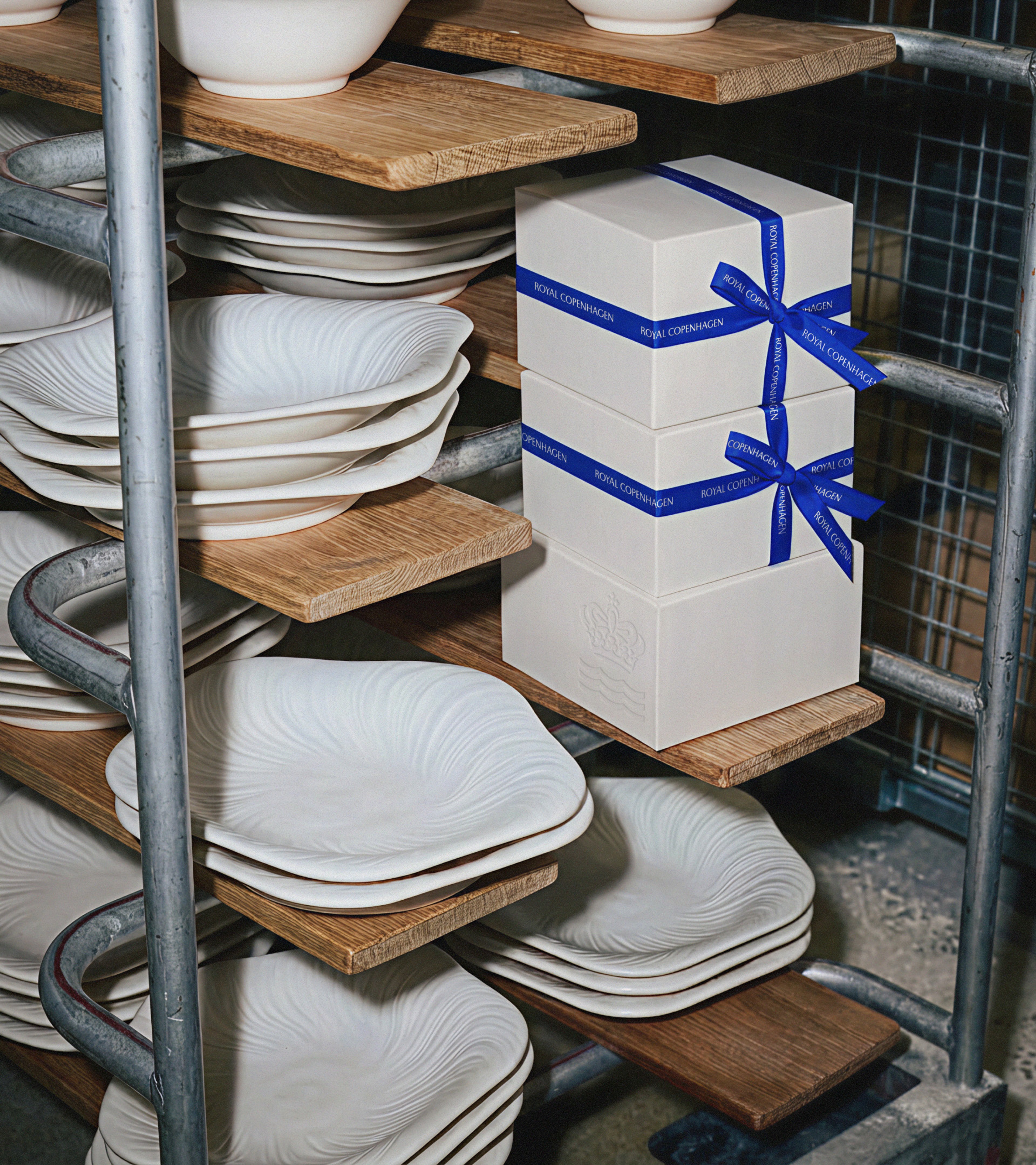
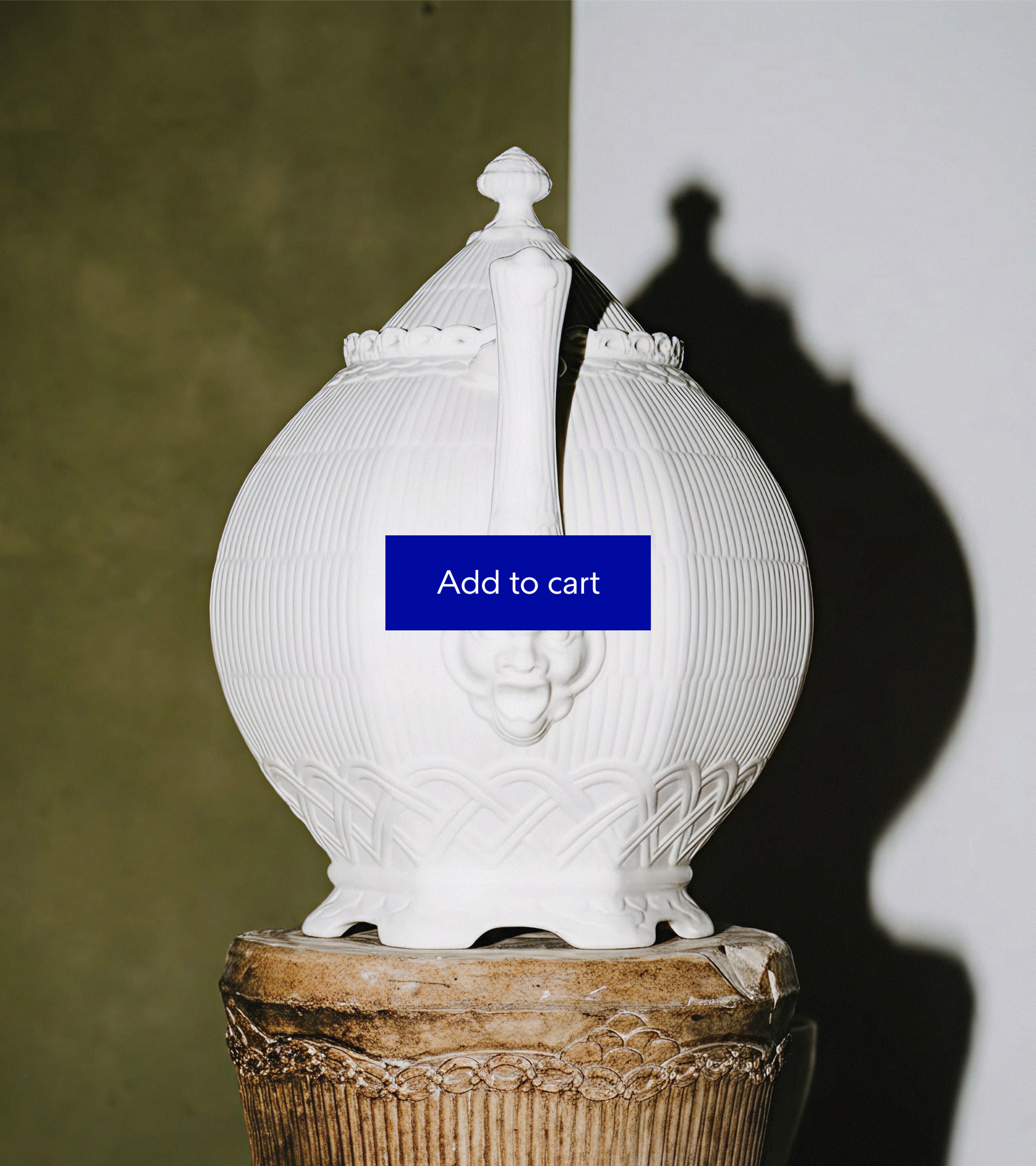
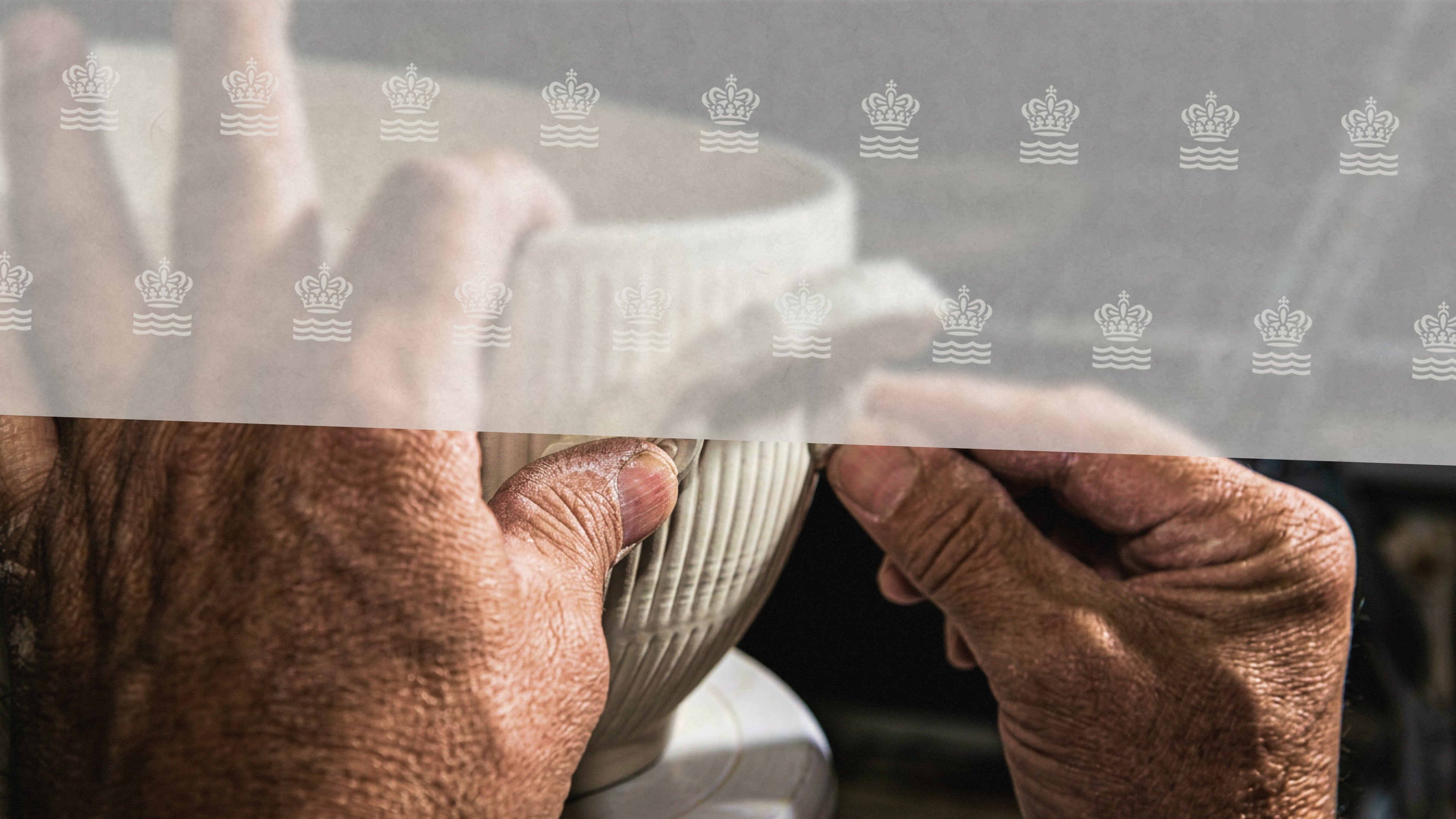
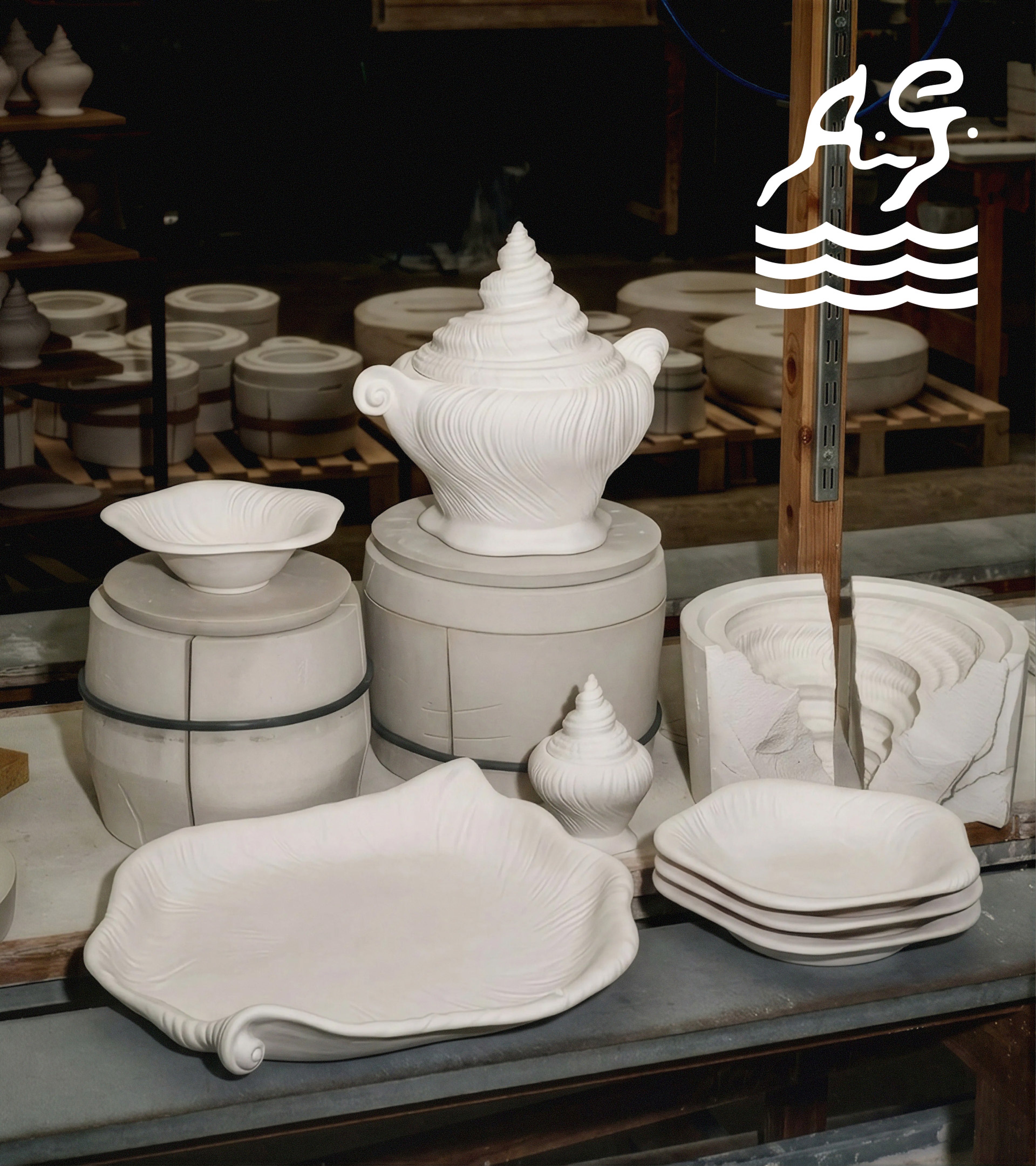
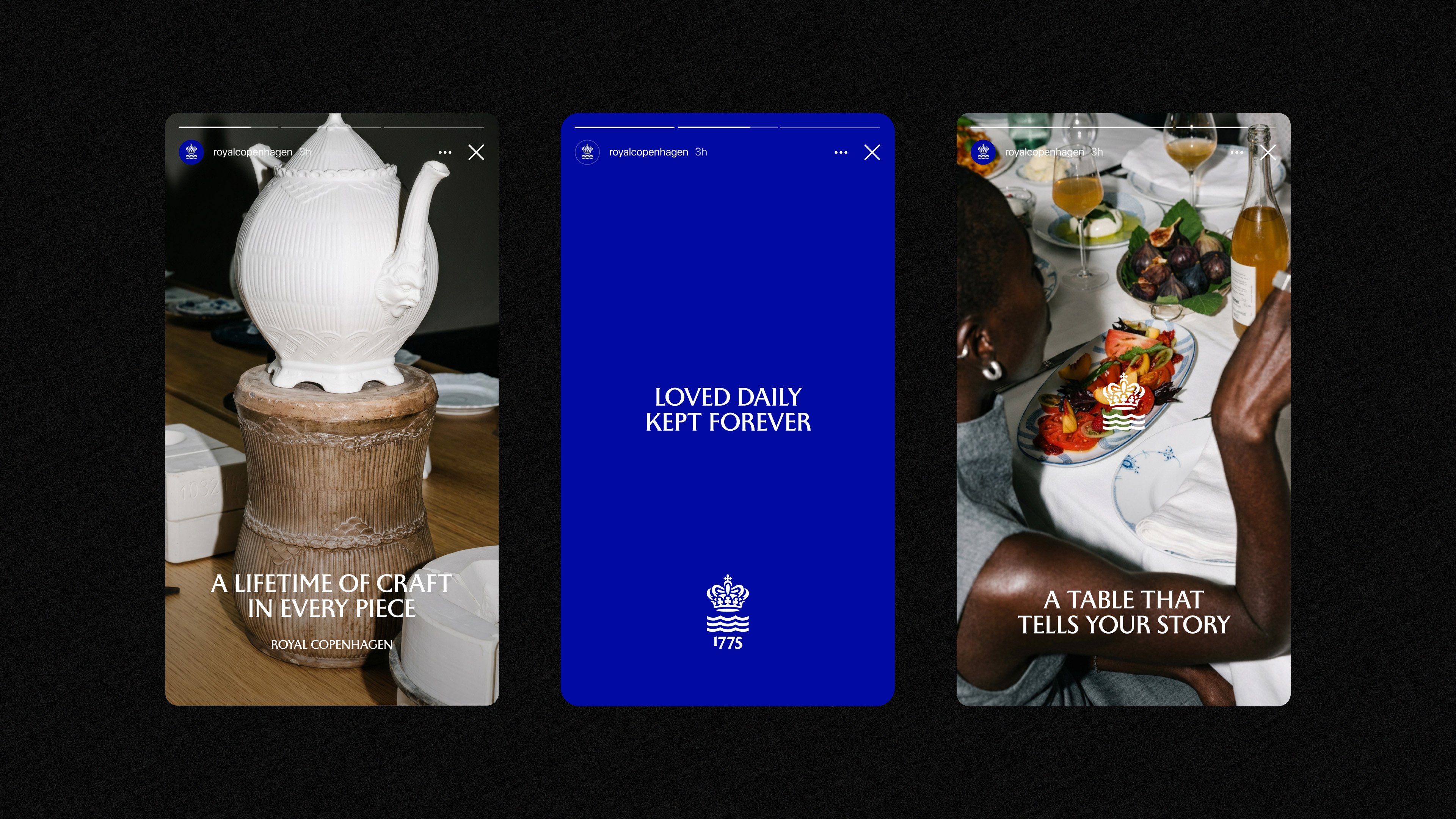
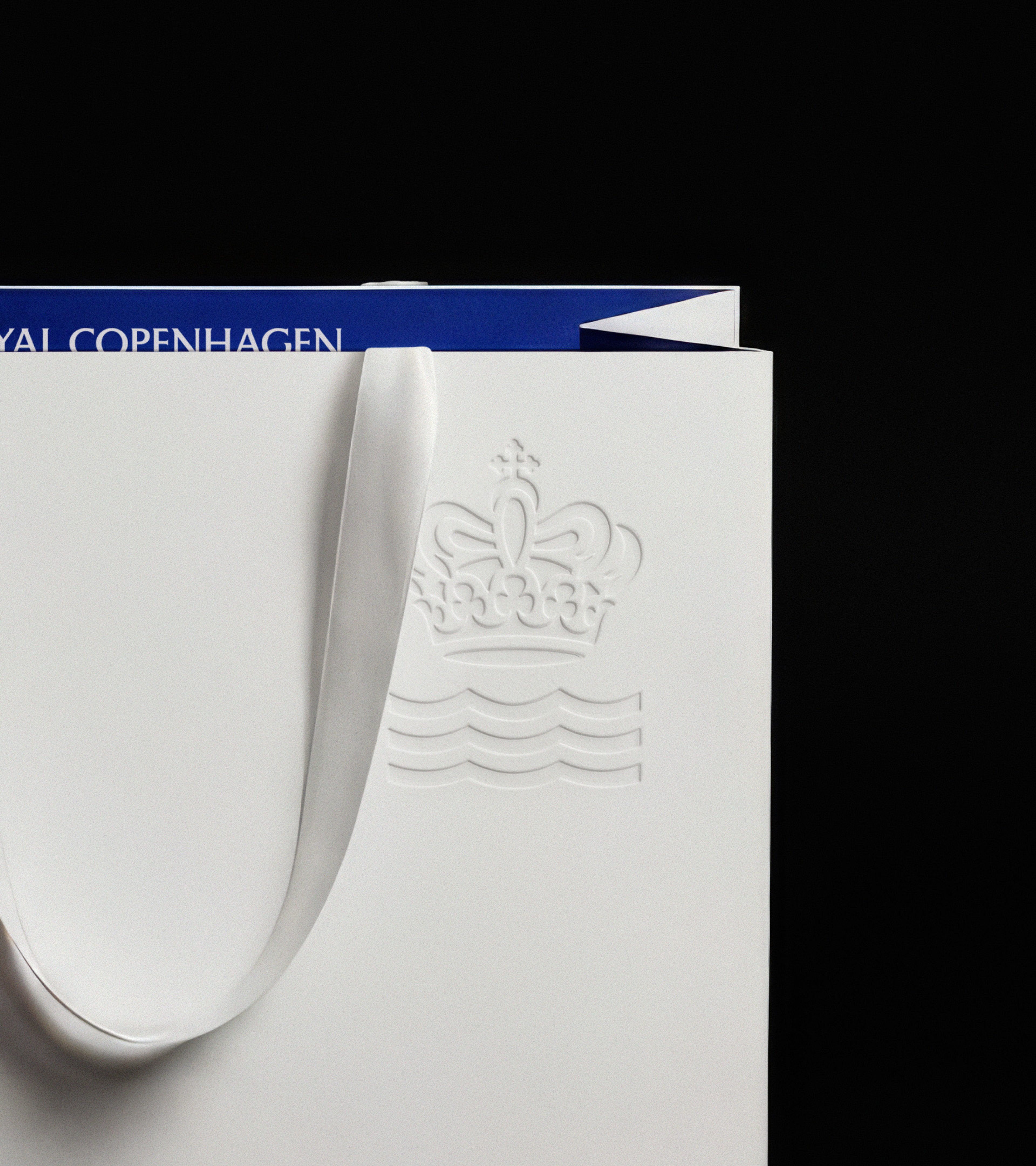
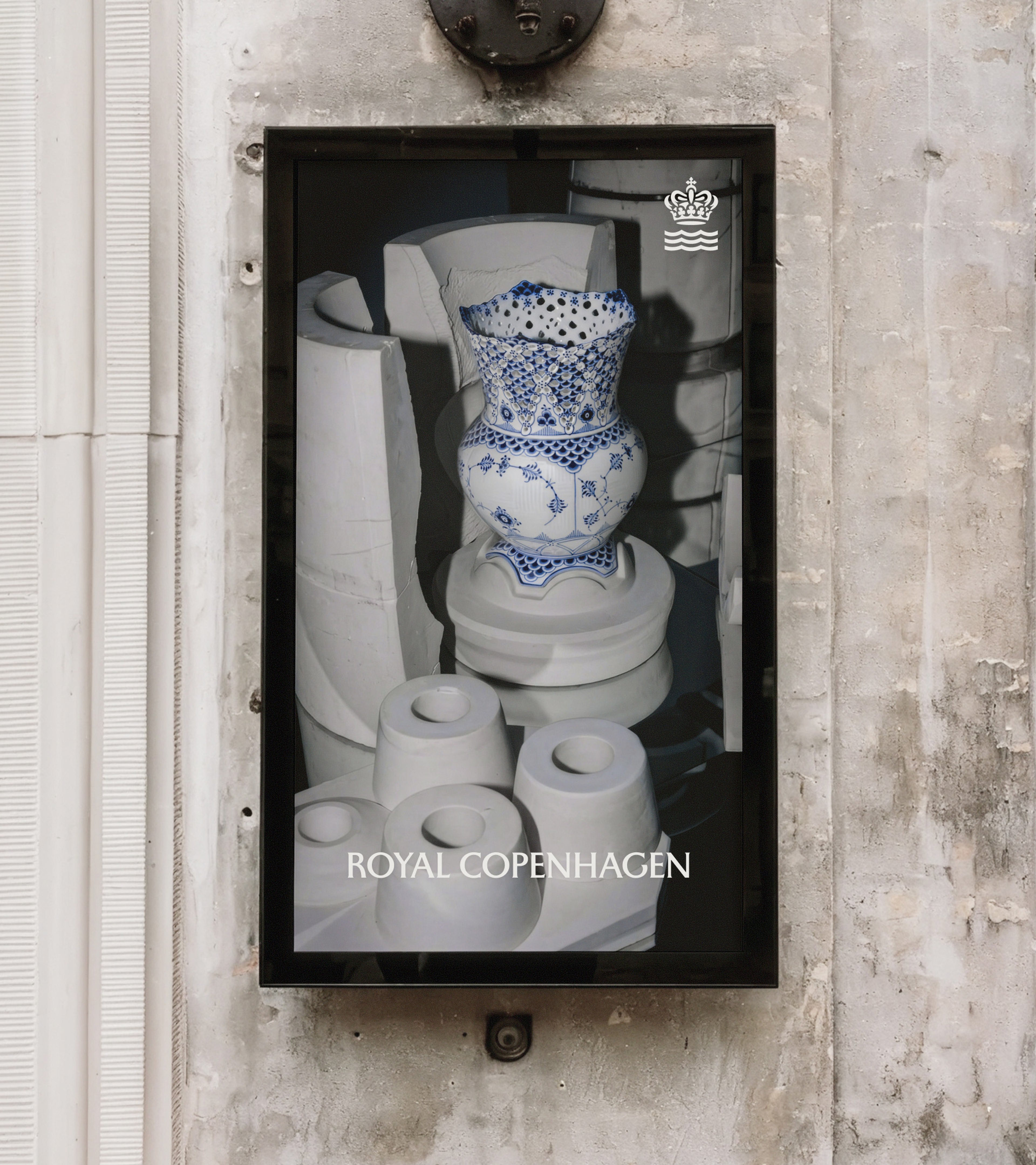
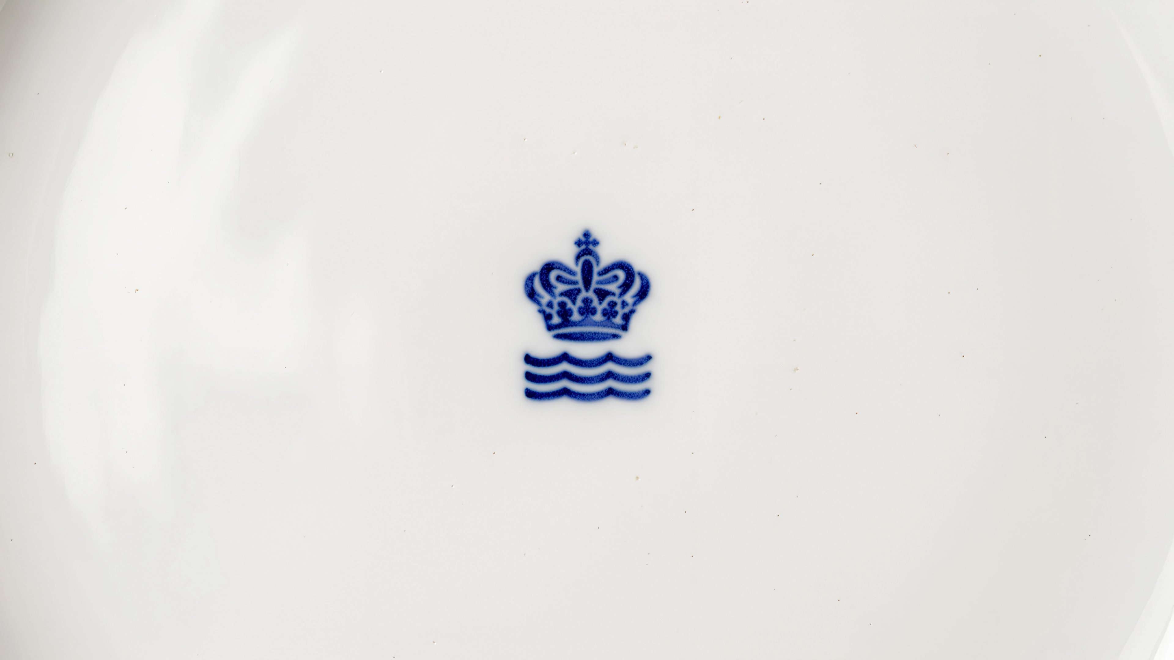
When you think of Danish heritage brands, you think of Royal Copenhagen. Their pieces have found themselves at the centre of life’s most significant, and most habitual moments for over 250 years. Family dinners, holiday celebrations, coffee dates. Today, they’ve grown into a global brand whose porcelain is highly regarded the world over. We partnered with Royal Copenhagen to redesign their visual identity to reflect the craft and care at their heart. It’s built around a simple idea: Royal Copenhagen is made with life. The life that’s carried in every brushstroke, in every party, in every generation their pieces are passed down to. At the identity’s centre sits a refined crown and wave, the symbols that have marked the brand for centuries, now cut with a more deliberate hand, and paired with a bespoke typeface as delicate as the porcelain itself.
Special thanks to